在 R 中可以使用 ggplot2 绘制各种非常漂亮的数据图。
ggplot2是Hadley Wickham基于Leland Wilkinson在Grammar of Graphics(图形的语法) 中提出的理论开发的,取首字母缩写再加上plot,于是得名ggplot。按照《图形的语法》 一书中的观点,一张统计图形就是从数据到点、线或方块等几何对象的颜色、形状或大小 等图形属性的一个映射,其中还可能包含对数据进行统计变换(如求均值或方差),最后 将这个映射绘制在一定的坐标系中就得到了我们需要的图形。图中可能还有分面,就是生 成关于数据的不同子集的图形。
使用ggplot2绘图的过程就是选择合适的几何对象、图形属性和统计变换来充分暴露数据中 所含有的信息的过程。
install.packages("ggplot2")
在 ggplot2 中可以使用 ggplot() 函数来初始化一个 ggplot 对象, 接着使用 + 操作符把图层加到 ggplot 对象上。 对于拥有多个图层的复杂图形,最好使用 ggplot() 来初始化。
library(ggplot2)
x <- runif(100);    # 均匀取 100 个随机点,并构造一个随机向量
y <- cosh(x - 0.1) + rnorm(100) * rnorm(100)/12
dat <- data.frame(x=x, y=y)  # 做成一个数据集
ggplot(dat, aes(x, y)) + geom_point() # 绘制散点图,相当于 qplot()
ggsave("r-plot-geom-point.png", dpi=72)
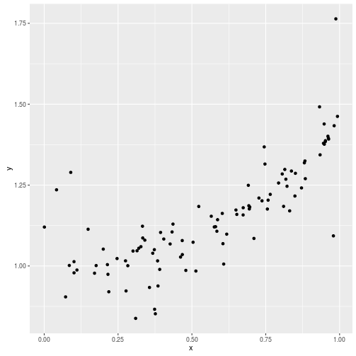 ggplot2的散点图
按 y 值指定颜色 (需要注意,不能写成 aes(colours=y),这会得到不同的效果。)
dat <- data.frame(x=x, y=y, col=rnorm(x,3), size=rnorm(x,5,2))
ggplot(dat, aes(x, y)) + geom_point(aes(colour=col, size=size))
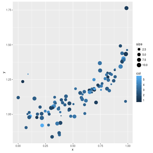 ggplot2的彩色散点图
从 RColorBrewer 中取一个连续色系对散点调色, 使用这个调色板来染色:
library(RColorBrewer)
x.cut <- cut(dat$col, 10)
x.col <- brewer.pal(10, 'BrBG')[as.integer(x.cut)]
ggplot(dat, aes(x, y)) + geom_point(color=x.col) + theme_bw()
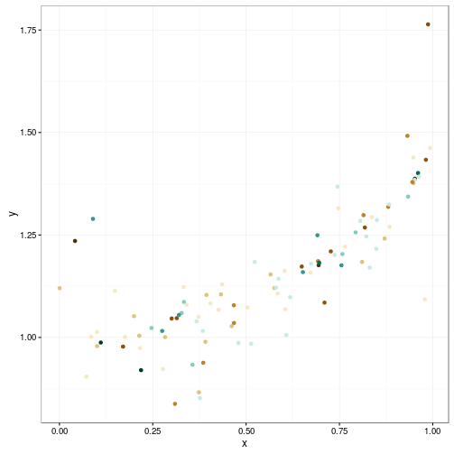 为ggplot2的彩色散点图指定brewer的色彩
如果使用 aes() 来指定颜色,实际上并没有按 x.col 中的颜色来染色,而是按 x.col 进 行分类,然后用默认的颜色赋给分类。
ggplot(dat, aes(x, y)) + geom_point(aes(color=x.col)) + theme_bw()
ggplot的图形元素可以主要可以概括如下:最大的是plot(指整张图,包括background和 title),其次是axis(包括stick,text,title和stick)、legend(包括backgroud、 text、title)、facet这是第二层次,其中facet可以分为外部strip部分(包括backgroud 和text)和内部panel部分(包括backgroud、boder和网格线grid,其中粗的叫grid.major ,细的叫grid.minor)。
ggplot2里的所有函数可以分为以下几类:
- 用于运算(我们在此不讲,如fortify,mean等)
- 初始化、展示绘图等命令(ggplot,plot,print等)
- 按变量组图(facet等)
- 真正的绘图命令(stat,geom,annotate),这三类就是实现一个函数一个图层的核心函数。
- 微调图型:严格意义上说,这一类函数不是再实现图层,而是在做局部调整。
- scale:直译为标尺,这就是与aes内的各种美学(shape、color、fill、alpha)调整有关的函数。
- guides:调整所有的text。
- coord:调整坐标。
- theme:调整不与数据有关的图的元素的函数。
把多张图画到一张画布上,可以使用如下的函数 (来源 Multiple graphs on one page (ggplot2) )
# Multiple plot function
#
# ggplot objects can be passed in ..., or to plotlist (as a list of ggplot objects)
# - cols:   Number of columns in layout
# - layout: A matrix specifying the layout. If present, 'cols' is ignored.
#
# If the layout is something like matrix(c(1,2,3,3), nrow=2, byrow=TRUE),
# then plot 1 will go in the upper left, 2 will go in the upper right, and
# 3 will go all the way across the bottom.
#
multiplot <- function(..., plotlist=NULL, file, cols=1, layout=NULL) {
  library(grid)

  # Make a list from the ... arguments and plotlist
  plots <- c(list(...), plotlist)

  numPlots = length(plots)

  # If layout is NULL, then use 'cols' to determine layout
  if (is.null(layout)) {
    # Make the panel
    # ncol: Number of columns of plots
    # nrow: Number of rows needed, calculated from # of cols
    layout <- matrix(seq(1, cols * ceiling(numPlots/cols)),
                    ncol = cols, nrow = ceiling(numPlots/cols))
  }

 if (numPlots==1) {
    print(plots[[1]])

  } else {
    # Set up the page
    grid.newpage()
    pushViewport(viewport(layout = grid.layout(nrow(layout), ncol(layout))))

    # Make each plot, in the correct location
    for (i in 1:numPlots) {
      # Get the i,j matrix positions of the regions that contain this subplot
      matchidx <- as.data.frame(which(layout == i, arr.ind = TRUE))

      print(plots[[i]], vp = viewport(layout.pos.row = matchidx$row,
                                      layout.pos.col = matchidx$col))
    }
  }
}
使用 ggplot2 统计作图并画多张图到一起的例子:
a <- ggplot(dat) + theme_bw()
multiplot(
    a + geom_density(kernel="gaussian", aes(y)),
    a + geom_dotplot(binwidth=0.03, fill=x.col, aes(y)),
    a + geom_histogram(binwidth=0.03, aes(y, fill=x.col), col='white'),
    a + geom_histogram(bins=7, aes(y), col='white', fill=brewer.pal(10, 'BrBG')),
    cols=2)
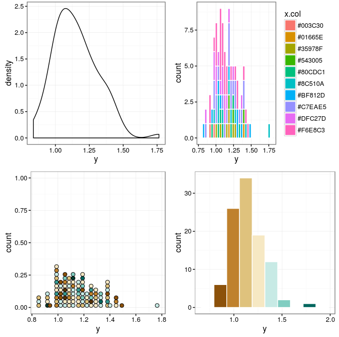 多张统计作图
上面当使用 geom_histogram(fill) 时,需要注意 bins 的个数为 fill 的颜色数减3。
稍微复杂一点,来画一张数据的变化趋势图。思路是先对数据进行平滑,然后表现出它的 标准差变化趋势,再把数据的散点、变化、平滑线综合到一张图上。
首先整理一下数据
x.sort <- sort(dat$x, index.return=TRUE)
x <- x.sort$x
y <- dat$y[x.sort$ix]
希望把数据按 1/20 的窗口宽度来统计局部标准差(移动标准差)
x.range <- range(x)
x.winnum <- 20
x.win <- (x.range[2] - x.range[1]) / x.winnum
y.sd <- y # make a copy
for(i in 1:length(x)) {
    y.sd[i] <- sd(y[(x < x[i] + x.win) & (x > x[i] - x.win)])
}
使用 lowess() 来获得平滑的曲线(这样得到的曲线比移动平均曲线要漂亮)
sm <- lowess(data.frame(x=dat$x, y=dat$y))
使用 geom_line() 画出平滑后的趋势, 使用 geom_ribbon() 画出局部标准差表示的范围, 使用 geom_point() 画出实际的样本点,得到如下的效果:
dat <- data.frame(x=x, y=y, sd=y.sd, sm=sm$y)
ggplot(dat) + theme_bw() +
    geom_ribbon(aes(x=x, ymin=sm-sd, ymax=sm+sd), fill='grey70') +
    geom_point(aes(x=x,y=y,colour=y)) +
    geom_line(aes(x=x,y=sm,colour=sm))
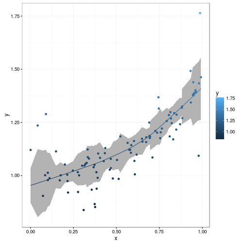 趋势图
趋势图